Product Discovery Through User-Centered Design
This project focused on redesigning an e-commerce website to create a smoother and more intuitive shopping experience. The primary goal was to improve how users discover products, navigate categories, and complete their shopping journey with minimal effort. The redesign followed a user-centered design approach, where every design decision was backed by usability principles rather than visual aesthetics alone. From research and wireframing to the final interface, the project emphasized simplicity, consistency, and accessibility while maintaining a modern and premium look.
Client
Personal Project
Timeline
1 Week
Role
UX Designer
Stack
About the Project
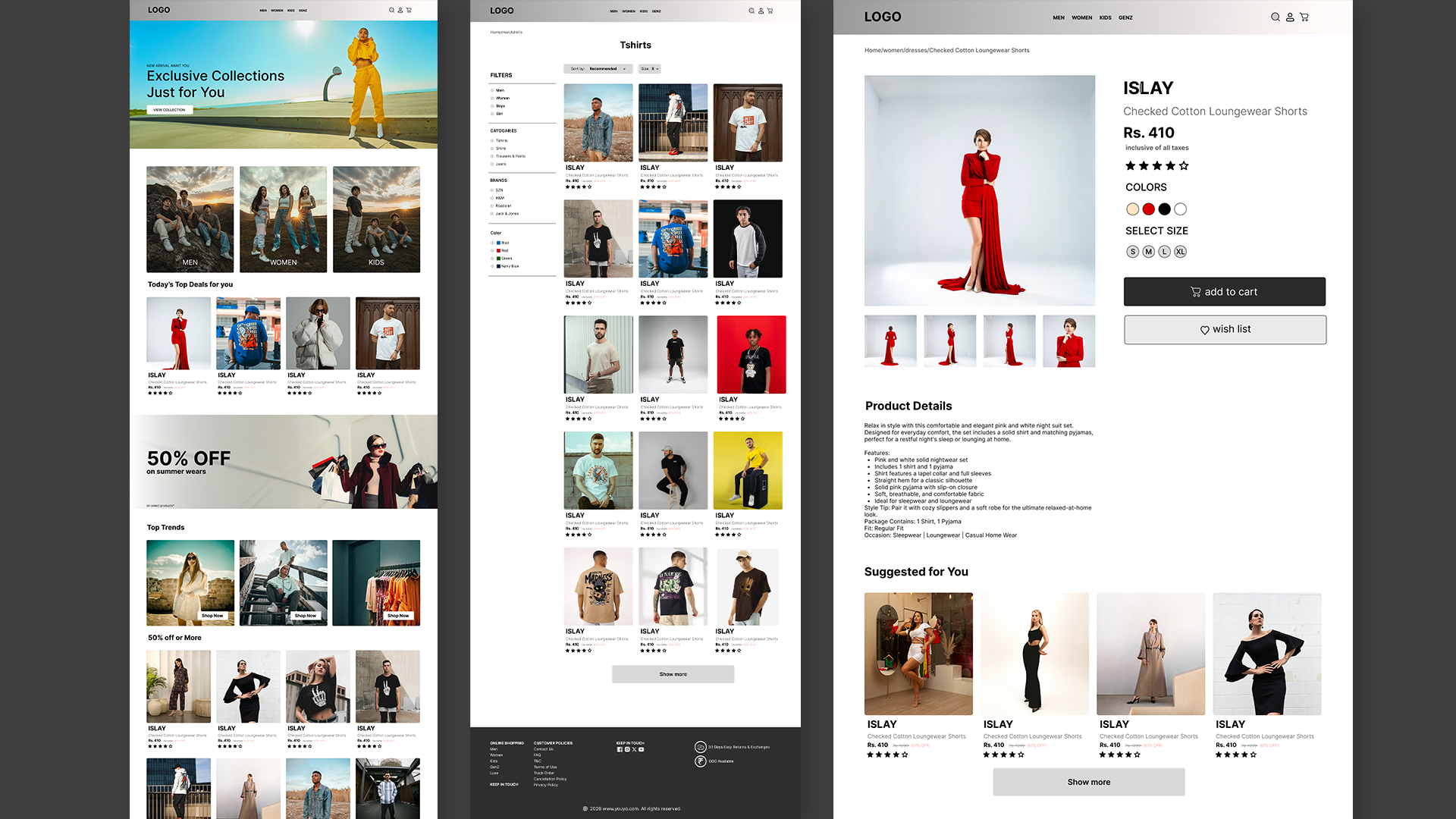
Online fashion stores often contain large product catalogs, making it difficult for users to quickly find what they are looking for. Many existing platforms suffer from cluttered layouts, inconsistent navigation, and complicated filtering systems that increase cognitive load and slow down the shopping process. These usability issues can negatively affect user engagement and conversion rates. This project aimed to solve these challenges by redesigning the entire browsing experience. The focus was on creating a clear visual hierarchy, simplifying navigation, improving product organization, and developing a scalable design system that could support future growth. Every screen was designed to guide users naturally through the shopping journey while keeping the interface clean, visually appealing, and easy to use.
Research
The project began with a research phase to better understand how users interact with fashion e-commerce websites and identify the pain points that commonly interrupt their shopping experience. I conducted competitor analysis by studying leading e-commerce platforms, evaluated their navigation patterns, product organization, and filtering systems, and reviewed established UX best practices for online retail. The research revealed several recurring usability issues. Product listings often lacked clear visual hierarchy, making it difficult for users to scan available options efficiently. Navigation structures were inconsistent, filters were either hidden or overly complex, and excessive scrolling made browsing feel tedious. Many interfaces also failed to properly highlight featured products or promotional content, reducing discoverability and engagement. Based on these findings, the primary design objective became creating a more intuitive shopping experience that minimizes user effort while improving product discovery. The redesign focused on simplifying navigation, strengthening content hierarchy, reducing unnecessary interactions, and maintaining consistency throughout the interface.
Wireframing
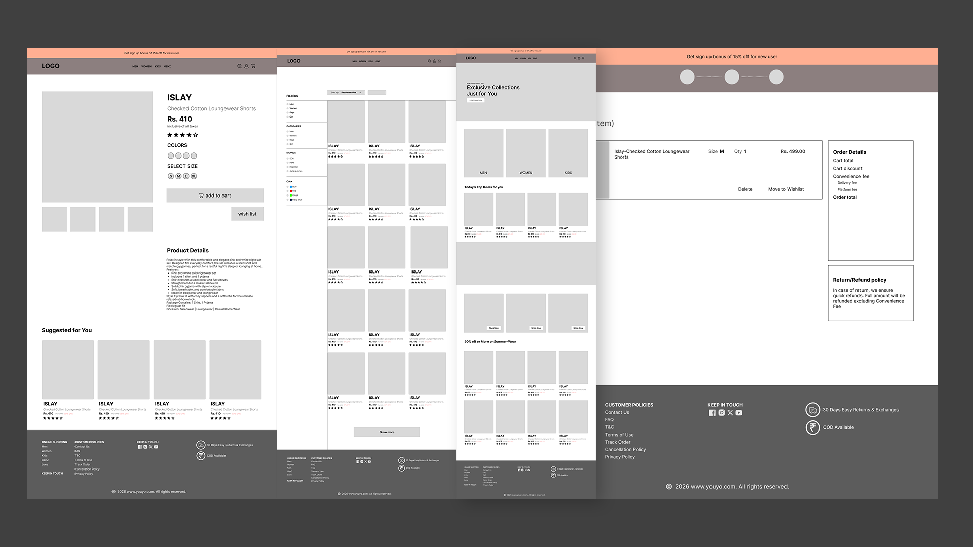
Before moving into visual design, I created low-fidelity wireframes to establish the overall structure and user flow of the website. This stage allowed rapid exploration of multiple layout ideas without being influenced by colors, typography, or branding. The focus remained entirely on usability, information architecture, and interaction design. The homepage was reorganized to better prioritize featured collections and promotional content, while navigation was simplified to help users move seamlessly between categories. Product listing pages were redesigned with improved grid structures and clearly positioned filtering options, making browsing more efficient. Product detail pages emphasized essential information, helping users quickly evaluate products without feeling overwhelmed. Developing wireframes early in the process made it possible to identify usability issues before investing time in high-fidelity design. This iterative approach ensured that the final interface was built on a strong structural foundation and aligned with user expectations.
Final Design
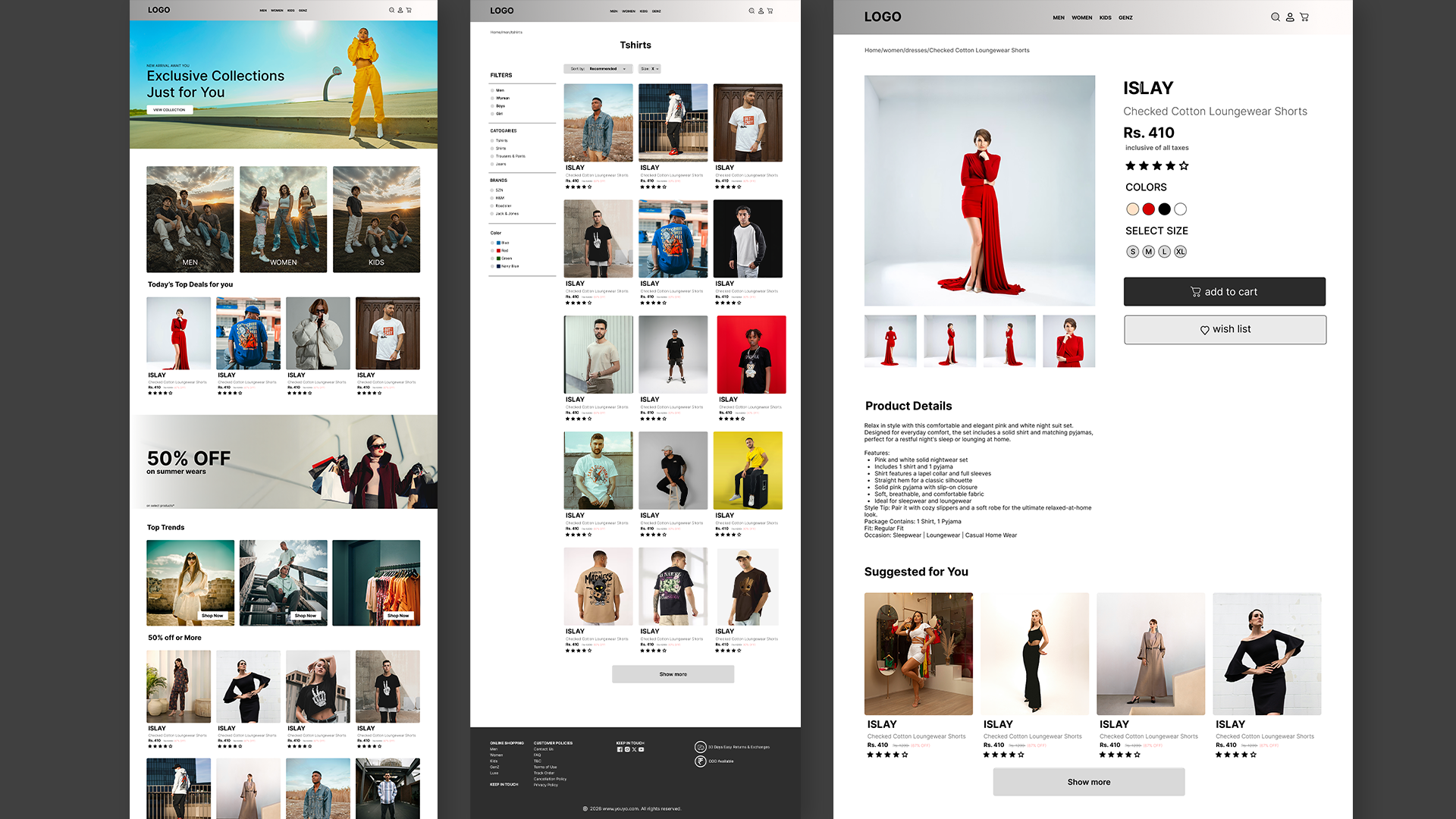
The final design transformed the wireframes into a polished, modern interface that balances visual appeal with usability. Large promotional banners, clean typography, generous spacing, and high-quality product imagery create a premium shopping experience while keeping the interface easy to navigate. Every component follows a consistent design system, ensuring a cohesive experience across all pages. The homepage introduces users to featured collections through prominent hero sections and category cards that encourage exploration. Product listings are organized into responsive grids with clearly displayed pricing, ratings, and essential product information, allowing users to compare items quickly. Improved filtering and navigation reduce friction throughout the browsing process, while consistent spacing and alignment create a clean and professional appearance. The redesign successfully delivers a more efficient shopping journey by making products easier to discover, simplifying navigation, and reducing cognitive load. The final outcome demonstrates how thoughtful UX research, structured wireframing, and user-centered interface design can significantly improve the overall shopping experience while maintaining an engaging visual identity.
Key Takeaways
This project reinforced the importance of research-driven design and iterative problem solving. It demonstrated that effective user experiences are created not only through attractive visuals but also through thoughtful information architecture, consistent interaction patterns, and careful attention to user behavior. By validating ideas through wireframes before moving into high-fidelity design, the project achieved a balance between functionality and aesthetics, resulting in an interface that feels intuitive, efficient, and enjoyable to use.